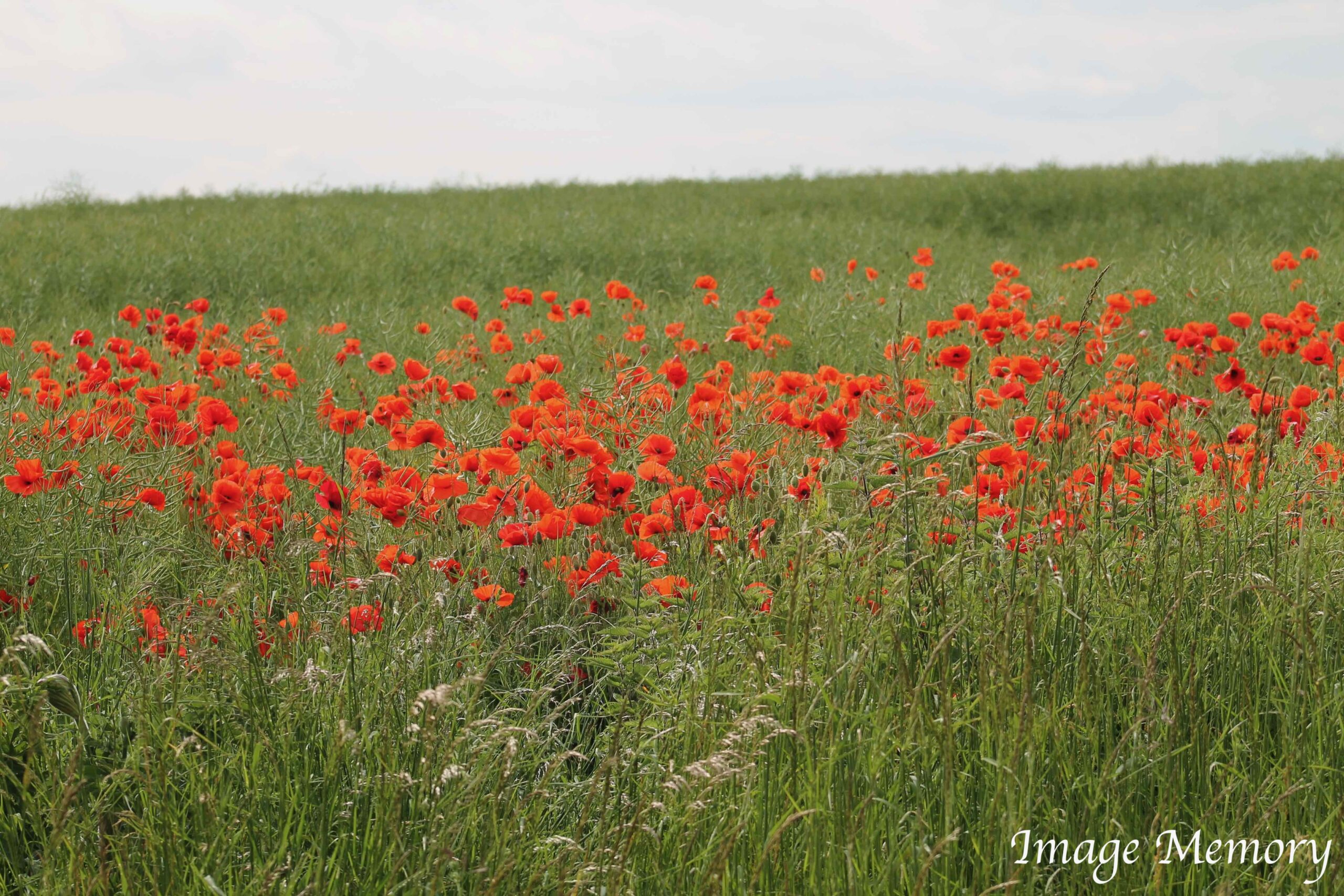
The Psychology of Colour – Red / Vermilion

Summer

Red exudes warmth and, like no other colour, radiates a strong and powerful energy that motivates us to take action.  It is used effectively as a warning colour on road signs and as the ‘stop’ light for traffic lights. Red lights also show car users when the driver in front is braking.

In medieval times, artists would use a mixture of sulphur and mercury, heated to very high temperatures, to produce red pigment.  Known as vermilion, red was also produced from cinnabar.

Cinnabar ore contains mercury.  The ore is toxic. Many miners lost their lives whilst mining the mineral as, when it is ingested, inhaled or comes in contact with the skin, it can lead to mercury poisoning.  This toxicity can lead to neurological damage, kidney problems and respiratory issues.

From the end of the 19th century a less harmful alternative to cinnabar was found, cadmium.  Today vermillion is made from modern, harmless and stable pigments.
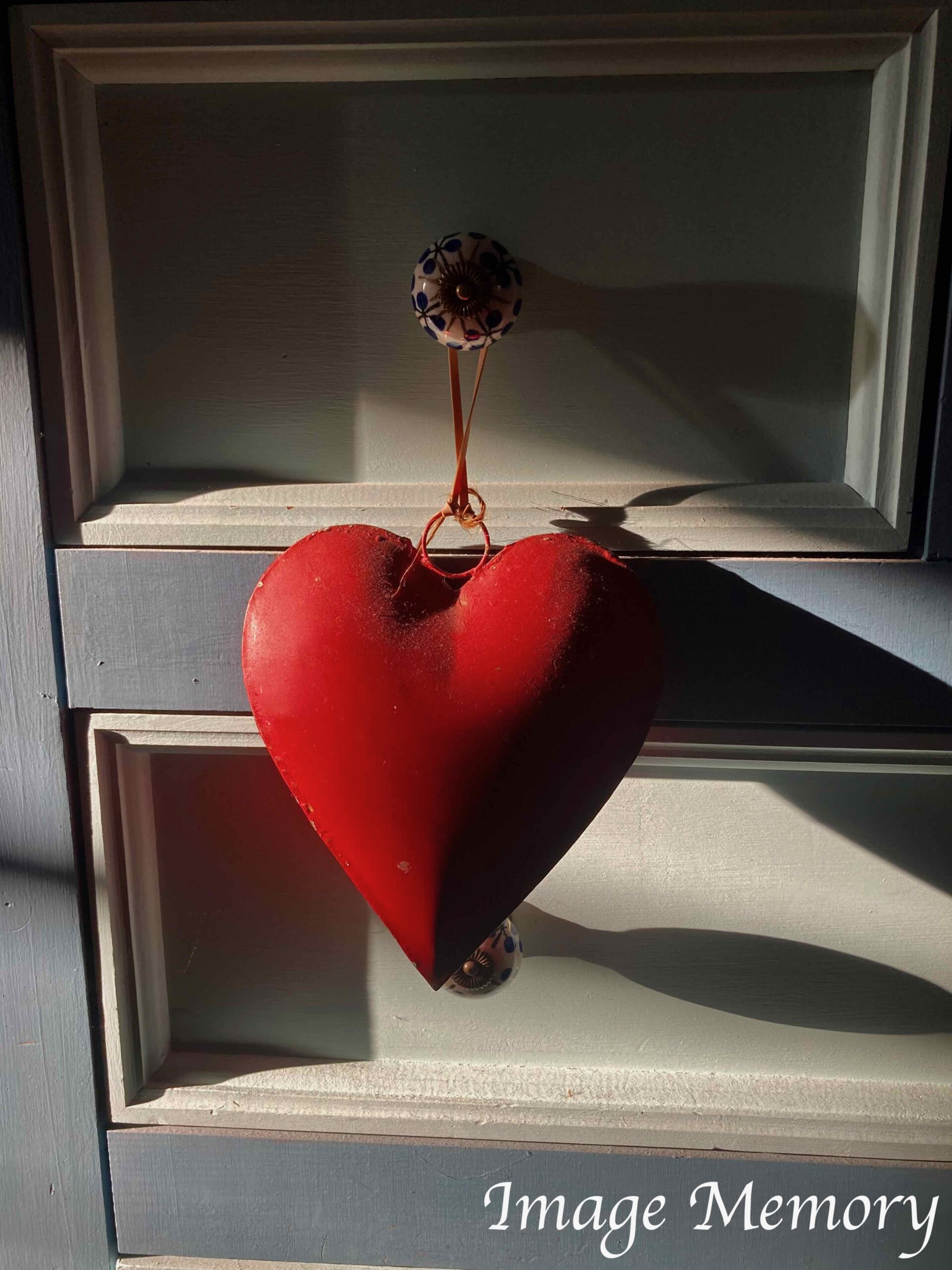
Love

Associations with the colour red include physical energy, passion, attention, stimulation and excitement.
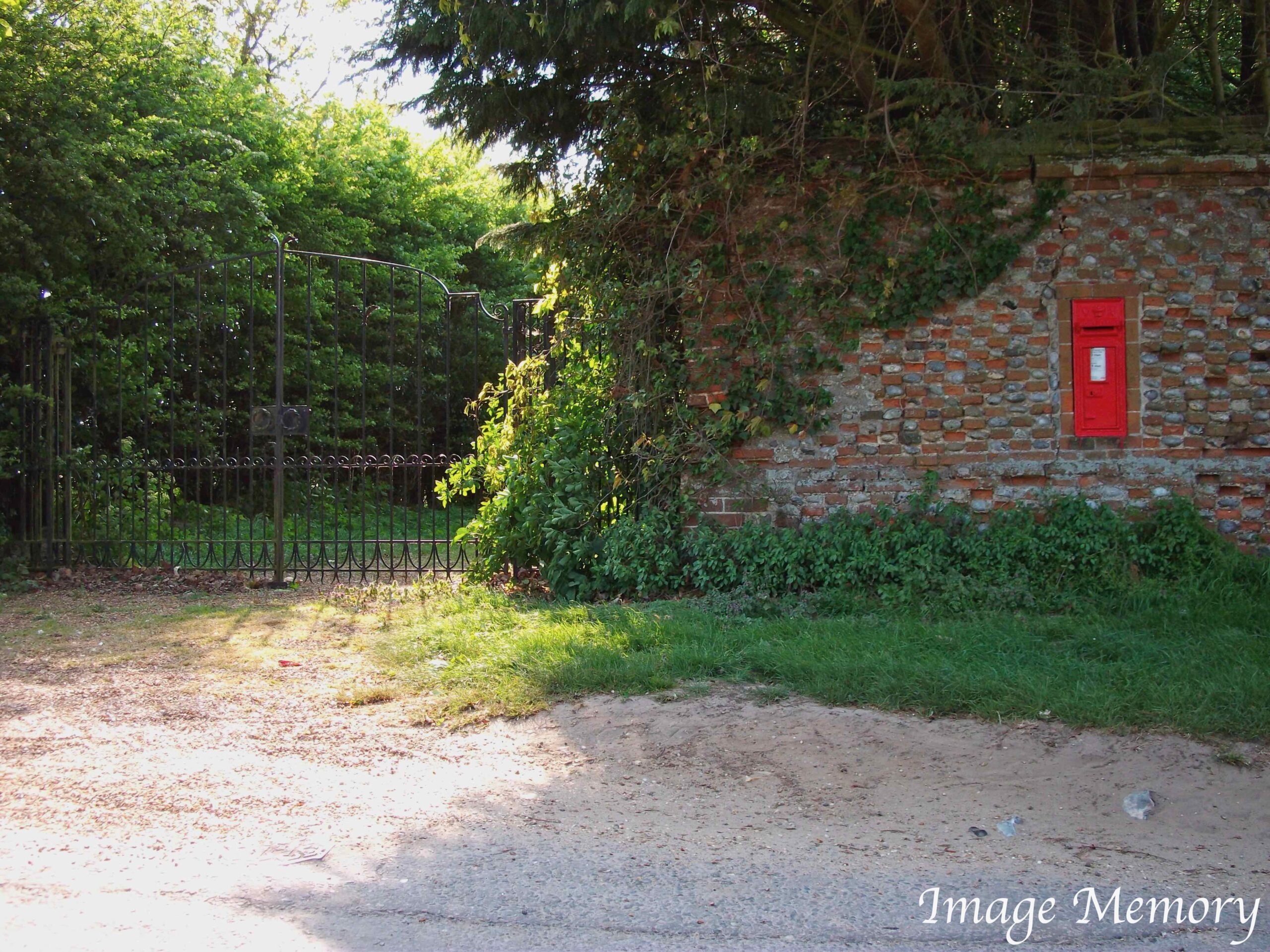
In the UK, pillar boxes are painted red and the original telephone booths were coloured red.
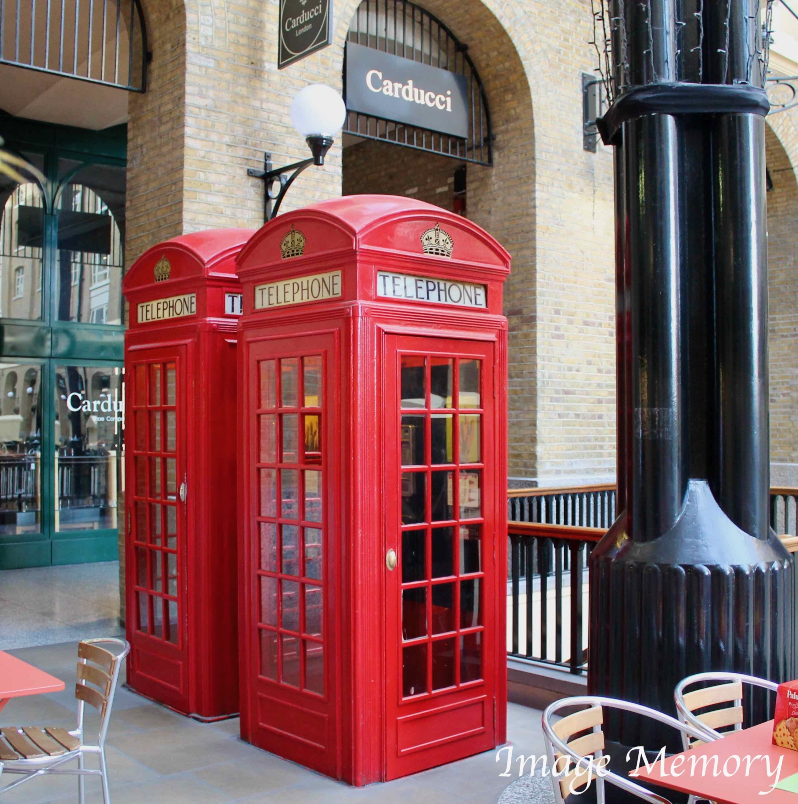
Red is also the colour of blood and has historical connotations with sacrifice, danger and courage.

In Roman times, on the battlefield, Roman soldiers wore a red tunic under their armour to represent blood and strength.  The compact line of the Roman infantry, dressed in red, had a psychological impact on the enemy, which perceived it as strong and valiant.

It is also the colour of war, Mars.  Roman soldiers and gladiators were both adorned in red.

In some accounts, Caesar’s face was painted red.  This was perhaps as an imitation of Rome’s highest and most powerful god, Jupiter.

China also has a love of the colour red.  Throughout the Ming dynasty (1368-1644) red was used as a signal of strength and power. The dynasty was founded in the south and the ruling family’s name, Zhu, means vermillion.

Red is the luckiest colour in Chinese culture.  It symbolises joy, vitality, celebration, success and good fortune.  It is used for weddings and for the Chinese New Year.

The colour red also has a capacity for arousal.  Red stimulates the physical and adrenalin.  It raises blood pressure, the heart and respiration.  The colour also evokes strong emotions and is considered intense and even angry.

Red is believed to sensitise the taste buds and sense of smell, thereby increasing appetite.  All this occurs because the heart rate instinctively quickens, which causes the release of adrenalin in the blood stream raising blood pressure and stimulating the nerves.

The colour red, in Hindu scriptures, activates the circulation system and benefits the five senses.   It is used to treat colds, paralysis, anaemia, ailments of the blood stream and lungs.

Goldstein asserts “under the influence of red light, time is likely to be overestimated”.

From a ‘brand’ perspective, it is easy to recall when red is used.

The adverts that depict father Christmas delivering CocaCola are memorable, as are the Virgin Atlantic reels encouraging individuality.

Next week in the Psychology of Colour series – YELLOW
 

New Blog Series -The Psychology of Colour

BLUE

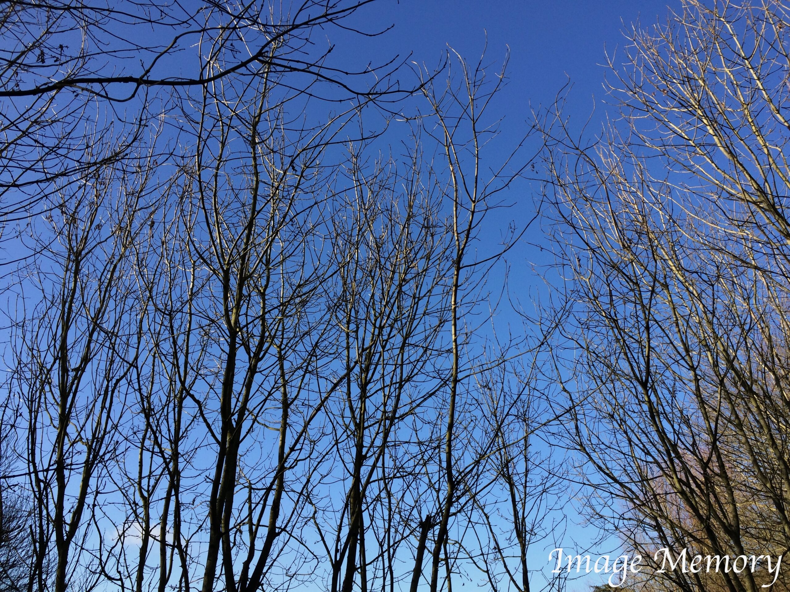
Blue light exposure can positively affect cognitive performance…

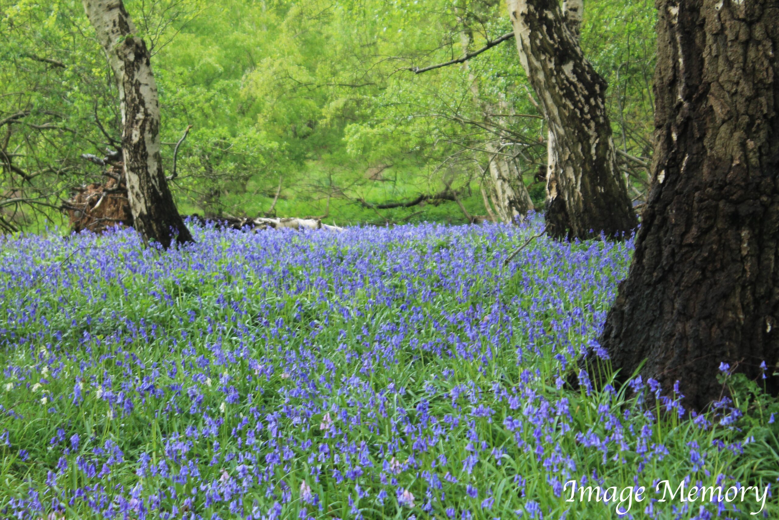
Bluebell Wood, Suffolk – Hugo Richardson

The Source of Blue

The origin of blue for use in art colouring came from the Ancient Egyptians, who created the first blue pigment as far back as 2,200BC.  Sand, ground limestone and copper-containing minerals, like malachite or azurite, were heated to high temperatures for blue in art.

However, alternative thoughts believe that the richest blue on earth is called ultra-marine, which means ‘over-seas’.  In Britain’s case, this means the Mediterranean Sea, literally the sea at the ‘middle of the earth’.

Ultramarine blue can be made from lapis lazuli. Lapis lazuli is normally a mixture of three minerals including lazurite (very complex blue mineral), calcite (calcium carbonate, which is white) and pyrite (an iron sulphide that is white gold in colour).

The finest lapis lazuli comes from Badakhshan.  The mines, on the precipitous walls of the upper Kokeha Valley, in North Eastern Afghanistan, have been worked for more than 6,000 years.

Lapis lazuli was not just used in paint, but four and a half thousand years ago, a pair of lapis-and-gold goats were placed in the royal cemetery of Ur in Mesopotamia. It was used on the Afghan Buddhas of Bamiyan, dated to the 6th century AD.

Around three-and-a-half thousand years ago, lapis was used to adorn the golden funeral masks and jewellery of the pharaohs.

Blue in a Business Context

Blue sky thinking is the thought process of limitless creation beyond conventional thought, limitless like the blue sky.  This type of thought requires a group of people that need to think outside the box in a ‘brainstorming way’.  The activity should not be constrained by the limits of practicality.

Exposure to blue light can positively affect cognitive performance, alertness and reaction time.  The colour blue is often used to decorate offices, because research has shown that people are more productive in blue rooms.

Blue calls to mind feelings of calmness and serenity.  It is described as peaceful and tranquil, secure and orderly.

Blue very well may improve sports that are reliant upon team work and decision-making.

Colour-chakra theory from Hindu scriptures adds: blue raises metabolism; is used to stabilise the heart, muscles and bloodstream; used to treat burns (methylene blue), skin diseases, glaucoma, measles and chicken pox and throat problems.

However, blue light, by raising metabolism, can decrease sleep quality and duration.

The River Stour, Early Saturday Morning – Hugo Richardson

Blue is calming, relaxing and healing but not as sedentary as indigo.

Jeanne Kopacz is an interior design professional and author of  ‘Colour in Three Dimensional Design’.  Kopacz suggests “the sight of the colour blue causes the body to release hormones when it is surveyed, particularly a strong blue sky.  Many believe blue can lower blood pressure, slow the pulse rate and decrease body temperature”.

Positive Associations (source, Envato Pty. Ltd.):

Trust, Loyalty, Dependability, Logic, Serenity, Security

Negative Associations:

Coldness, Aloofness, Emotionless, Unfriendliness, Uncaring, Unappetising

NEXT WEEK,  The Psychology of Colour: RED

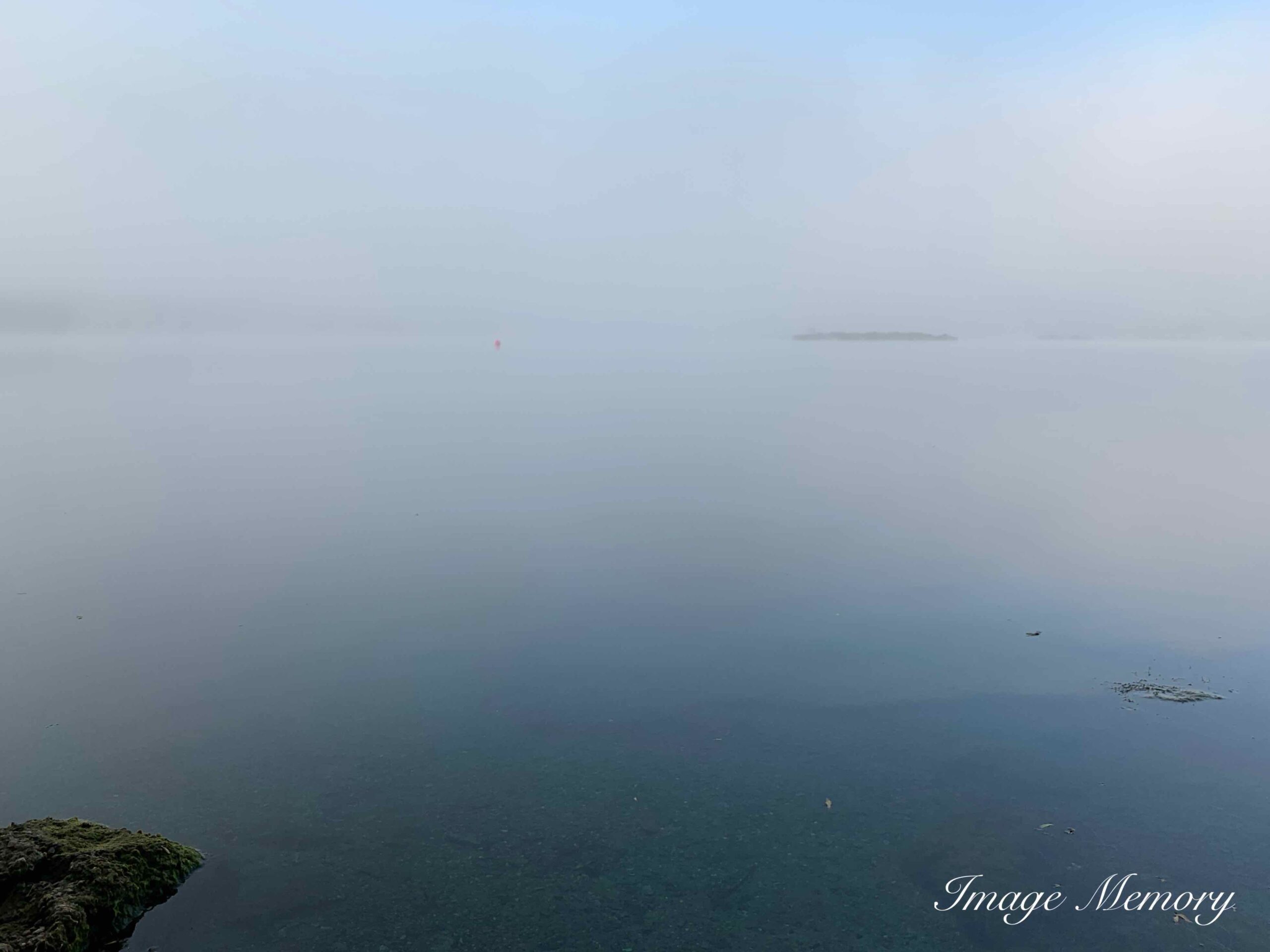
Calm Morning Mist, Image Captured During Covid – Hugo Richardson

Turner and the Elements – Earth

Castle Ruins and Small Village Landscape, Joseph Mallord William Turner, c. 1798-1799

Joseph Turners work can be viewed at:

https://www.tate.org.uk/visit/tate-britain/display/jmw-turner

Mountains, Crags and Rocks

“Roughness forms the most essential part of difference between the beautiful and the picturesque”  William Gilpin (1724-1804).

In the second half of the eighteenth century, the English clergyman and author William Gilpin formulated an aesthetic theory of landscape.  This was published in 1786.

Opinions of landscape design formed a “picturesque” debate.  Lancelot “Capability” Brown and Humphrey Repton represented one side of the spectrum.  They were in contrast to the ideas of William Gilpin and Richard Payne.

Landscapes by Brown and Repton are characterised by undulating expanses of grass and hills, broken up by clumps of trees and serpentine lakes to impress serenity.  This style required dramatic landscape alterations; an endless number of trees would be cut down, and an entire village would be relocated in the name of “improvement.”

Gilpin preferred rugged and moody landscapes that could also invoke the sublime. Gilpin observed that the appearance of the landscape changed depending upon the clouds and the quality of light.

Turner’s interest in the element of earth must be looked at in the context of contemporary developments in landscape painting in Britain.

Gilpin published his observations and encouraged British landscape artists to pursue atmospheric phenomena. He illustrated this contention in watercolours that brought the landscape to life through the use of chiaroscuro.

The fine art term chiaroscuro comes from the Italian words that roughly translate to light and dark.  Chiaroscuro technique is employed in the visual arts to represent light and shadow as they define three-dimensional objects.  Turner followed Gilpin’s example in exploring British landscapes.

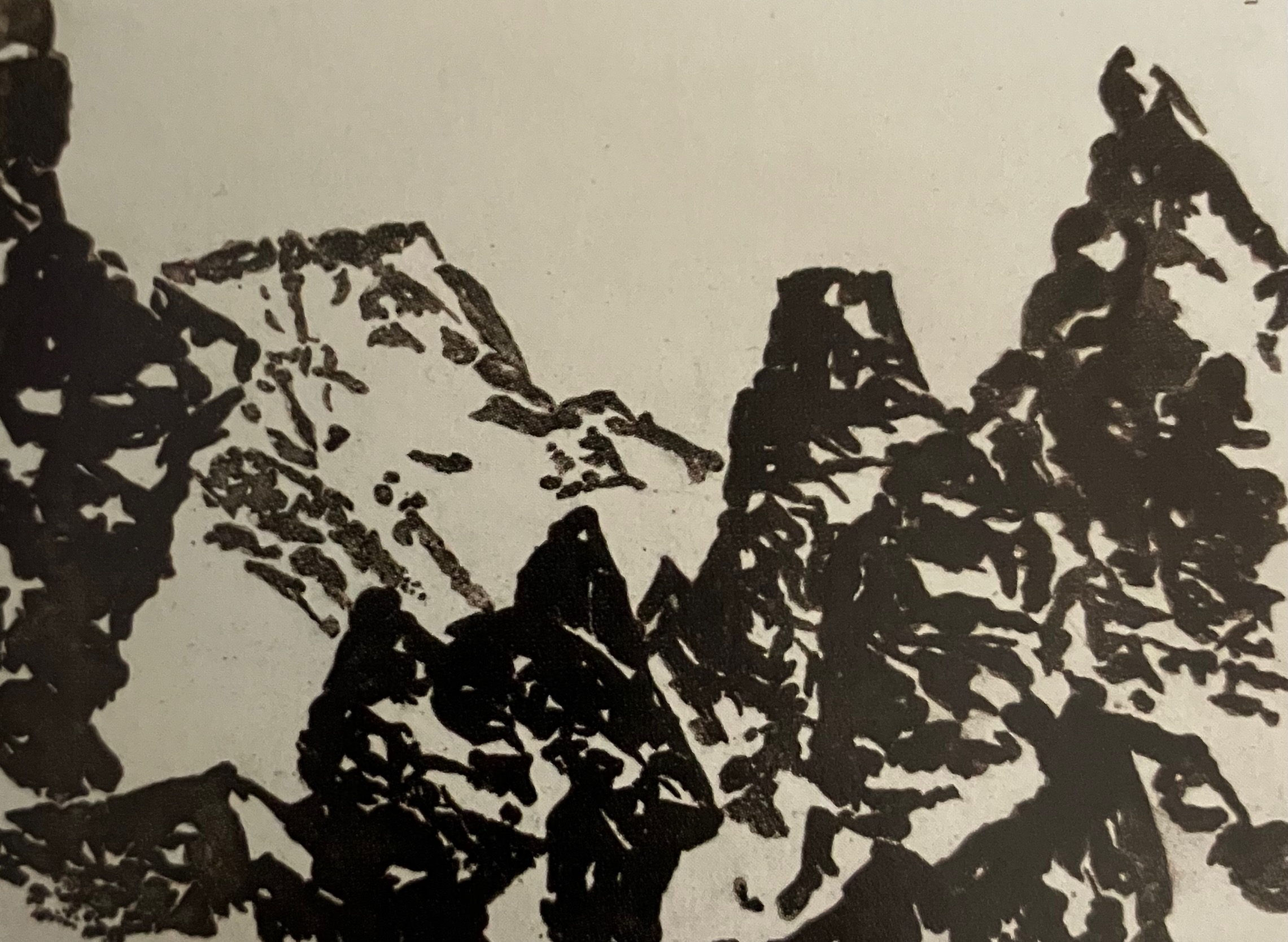
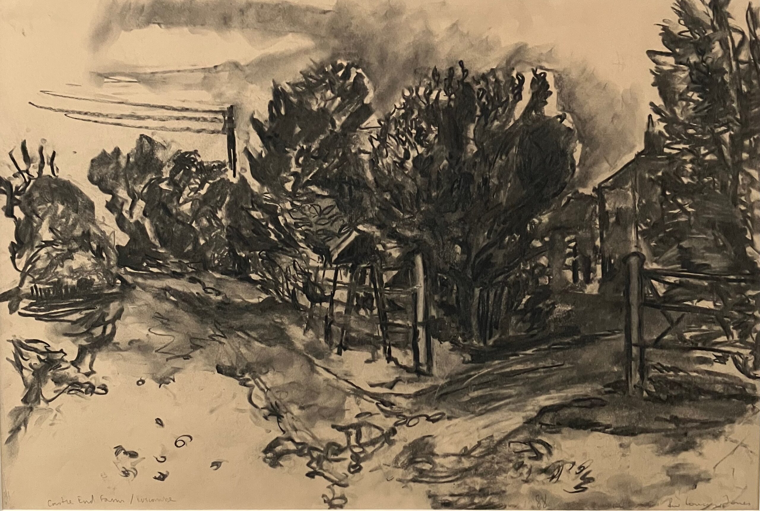
Here are some ‘monochromatic’ samples of the chiaroscuro method:

Mountain Peaks, Alexander Cozens, c. 1785

Alexander Cozens work can be viewed at https://www.tate.org.uk/art/artists/alexander-cozens-118 

Castle End Farm, Luscombe, Richard William Conway-Jones, 1988

Richard is a contemporary artist, his work can be viewed at:

http://www.conway-jones.co.uk

From a personal perspective, my approach to photography has been, as much as is possible, that of an artist.

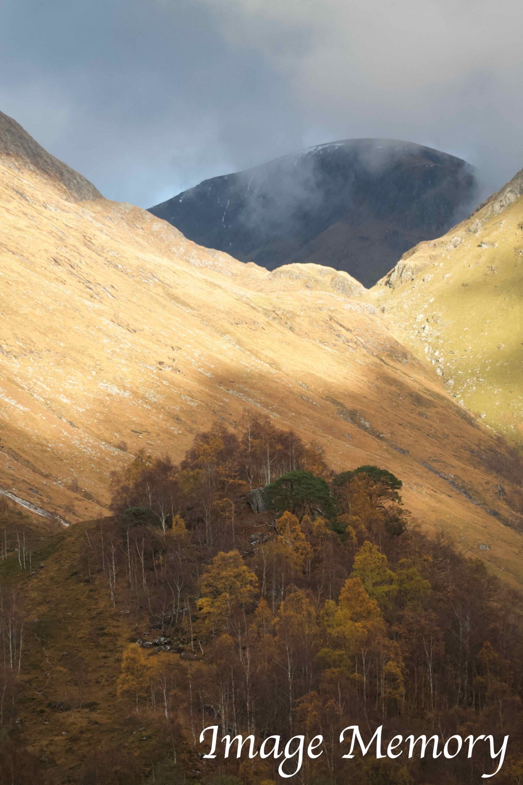
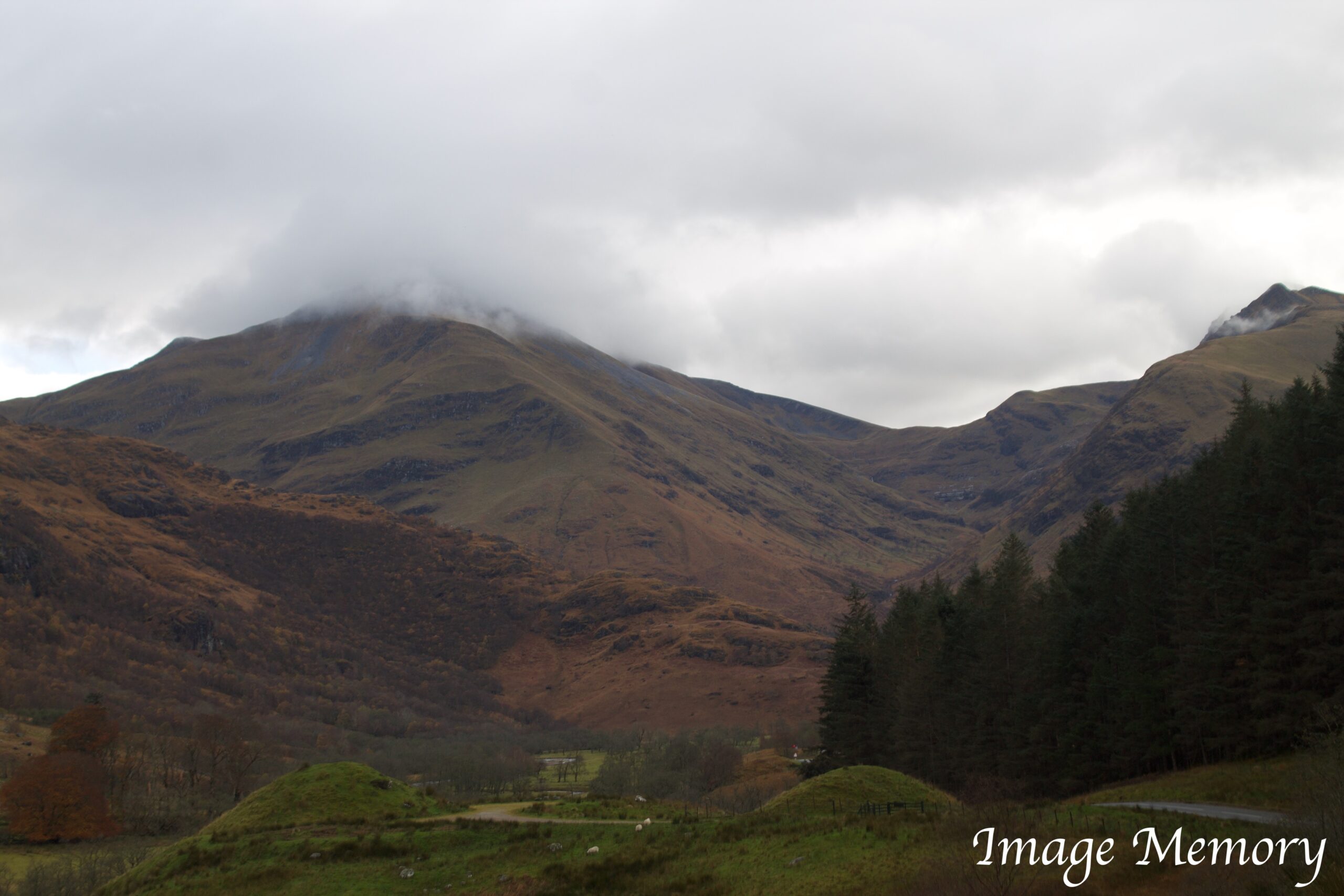
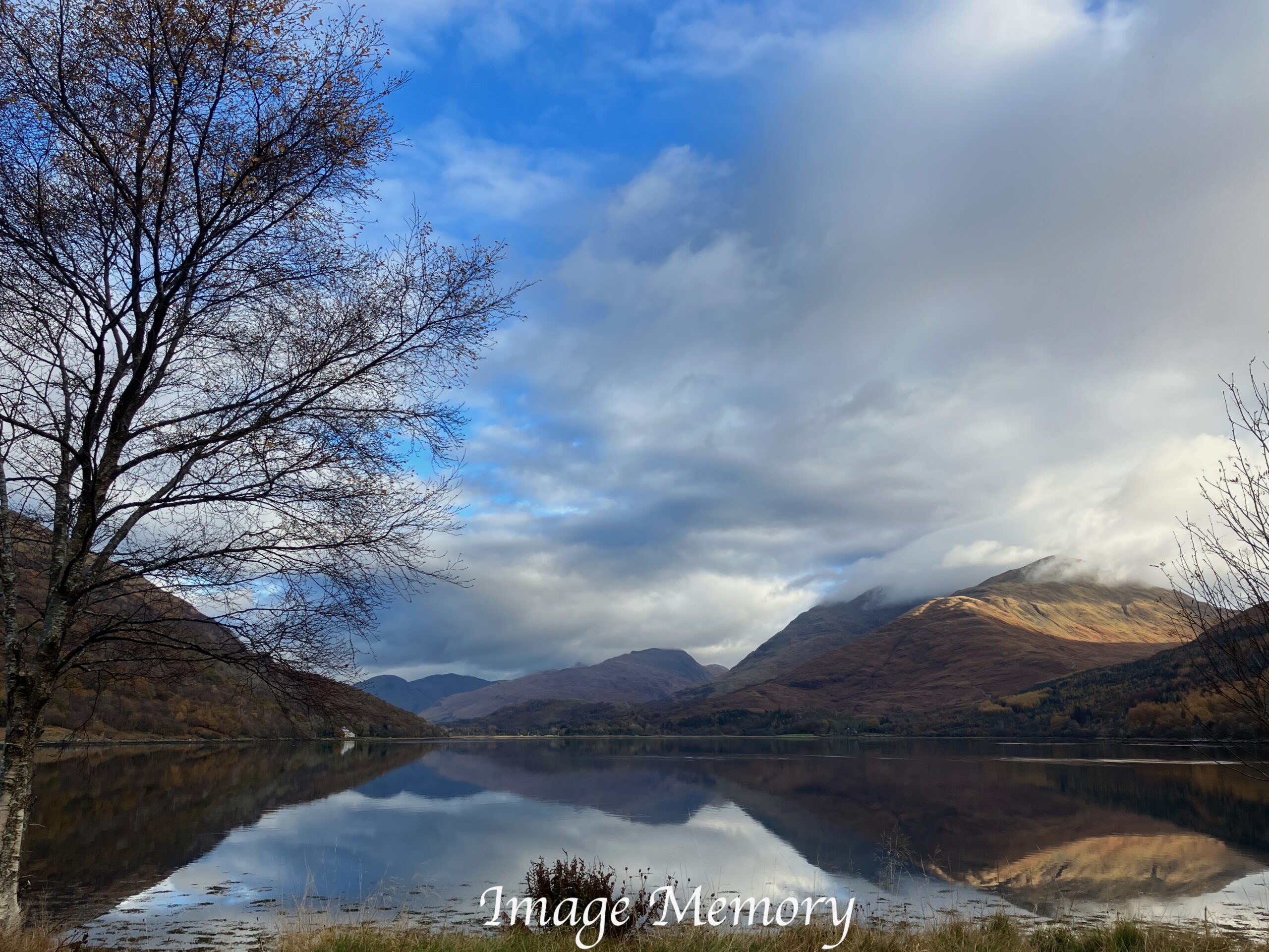
I feel drawn to the mountains of Wales, Scotland and the Lake District. This Scottish landscape photo below shows trees growing where God and nature has decided. The picturesque stark mountains that reach the sky are easier to capture when the light is less intense.  I hope you can appreciate Gilpin’s ‘atmospheric phenomena’.

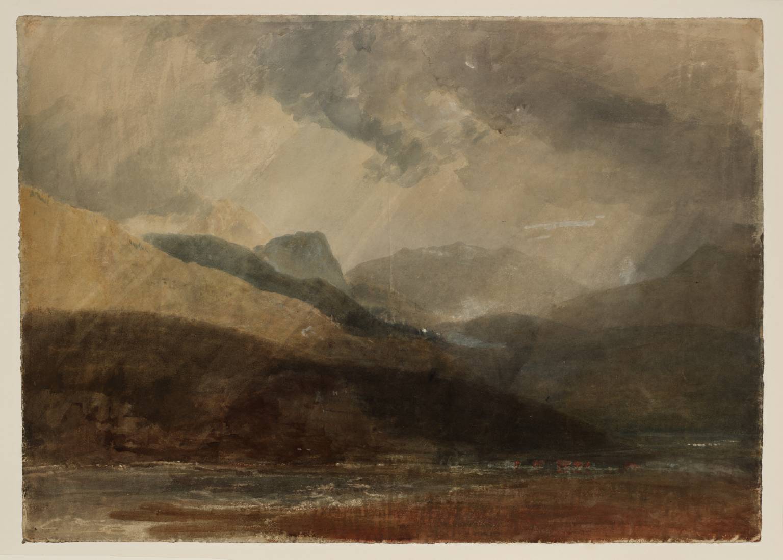
Blair Atholl, Looking towards Killiecrankie circa 1801 Joseph Mallord William Turner 1775-1851 Accepted by the nation as part of the Turner Bequest 1856 http://www.tate.org.uk/art/work/D04179

Glen Nevis, Hugo Richardson, November 2023

Scottish Landscape, Hugo Richardson, November 2023

I like mountains as a subject for photographic landscapes.  I have experimented with light and shadow options and seasonal light intensity variations can have an effect on the mood of the image.

Clearly, where the outline of mountains meet the sky, having a ‘chiaroscuro’ methodology in the mind of the photographer, can help.

Through the value gradation of colour and the analytical division of bright and shadowed shapes, the chiaroscuro artists create the illusions of three-dimensional forms and the light coming from a specific source, often achieving dramatic effects.

By 1801, the twenty-six-year-old Turner was already an Associate of the Royal Academy.

Turner was at the centre of intellectual life.  The Academy was at the right-hand side of Somerset House, next to the Society of Antiquaries.

Sir Francis Chantrey (sculptor),  Sir John Soane (architect)  and Sir Thomas Lawrence (painter) were fellows of the Royal Society.

The Academicians attended lectures on the most complex discoveries in science and it was suggested Turner was an invited guest.

Sir William Herschel (1738-1822) presented papers on the nature of the sun.

Herschel had looked at the sun with a giant telescope in Slough.  He found a range of particular features that he called “openings, shallows, ridges, nodules, corrugations, indentations and pores”.

He filtered the harmful magnified light through a tray of watered ink.

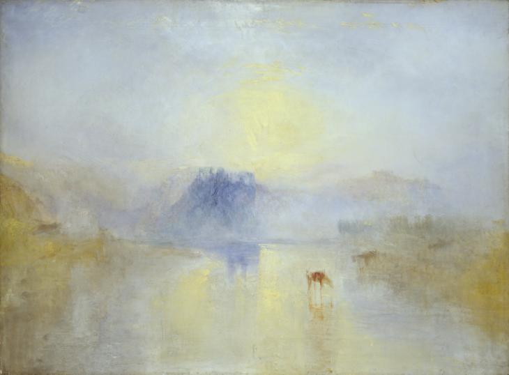
Turner too looked at the sun and purposefully gives a dab of the brush bristles, raising nodules of paint; a wipe of the flat areas of paint making parallel ridges and a smoothed area.

Norham Castle, Sunrise c.1845 Joseph Mallord William Turner 1775-1851 Accepted by the nation as part of the Turner Bequest 1856 http://www.tate.org.uk/art/work/N01981

Capturing photographic images of the sun is best left till the sun is rising or setting. I took this photo in 2016. When the image was downloaded from the ‘SIM card’, a spotlight from the sky appeared to light up a small area of the ground. This image has not been adjusted, to this day I do not know how the photo is possible!

Landscape Sunset Near Pewsey, Hugo Richardson, November 2016