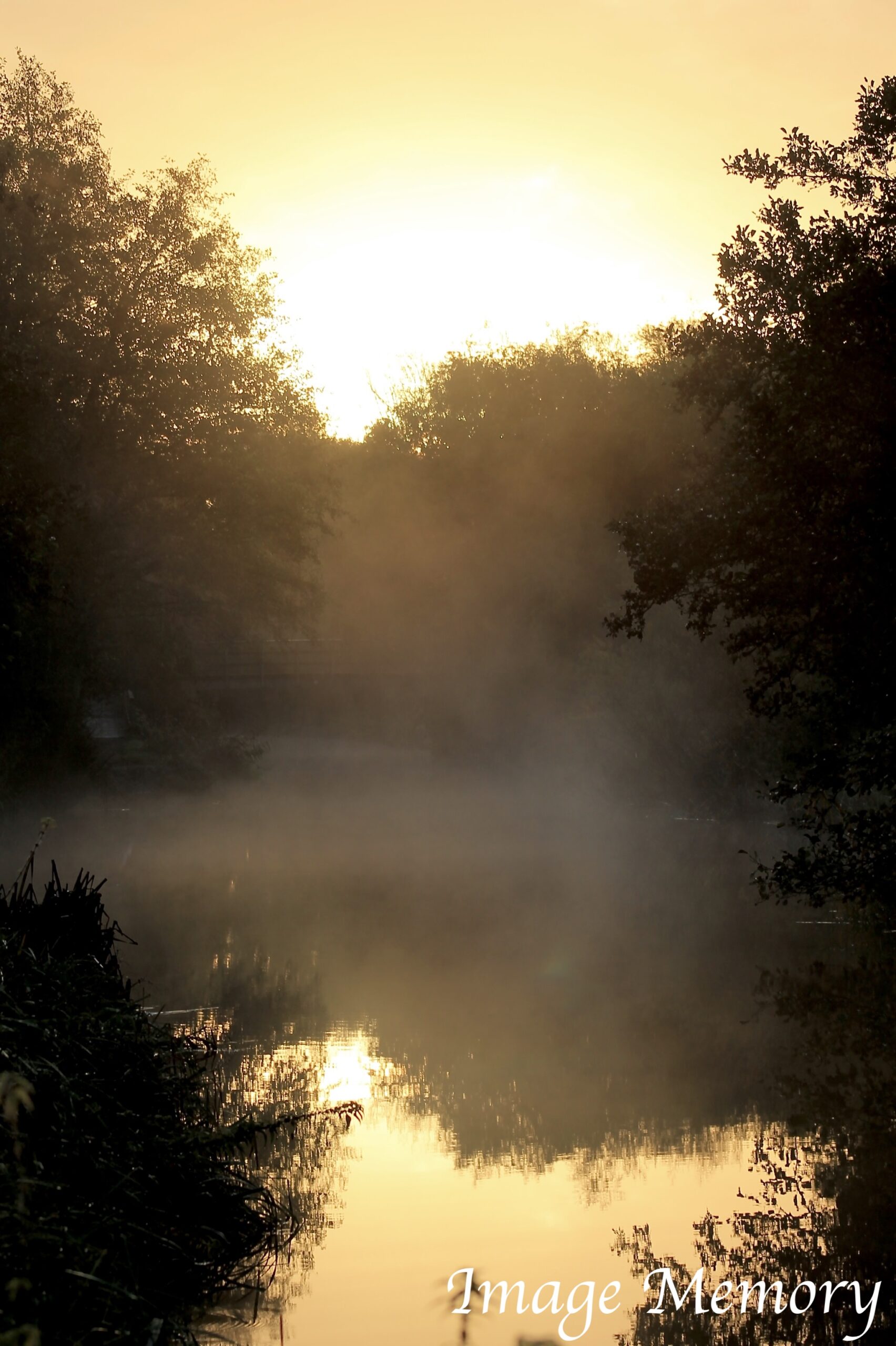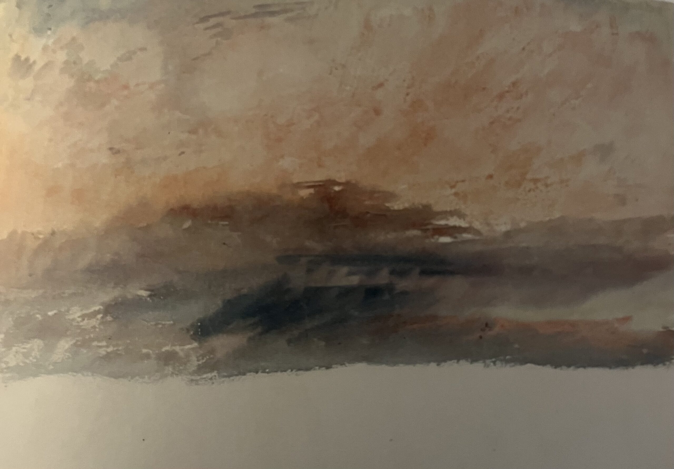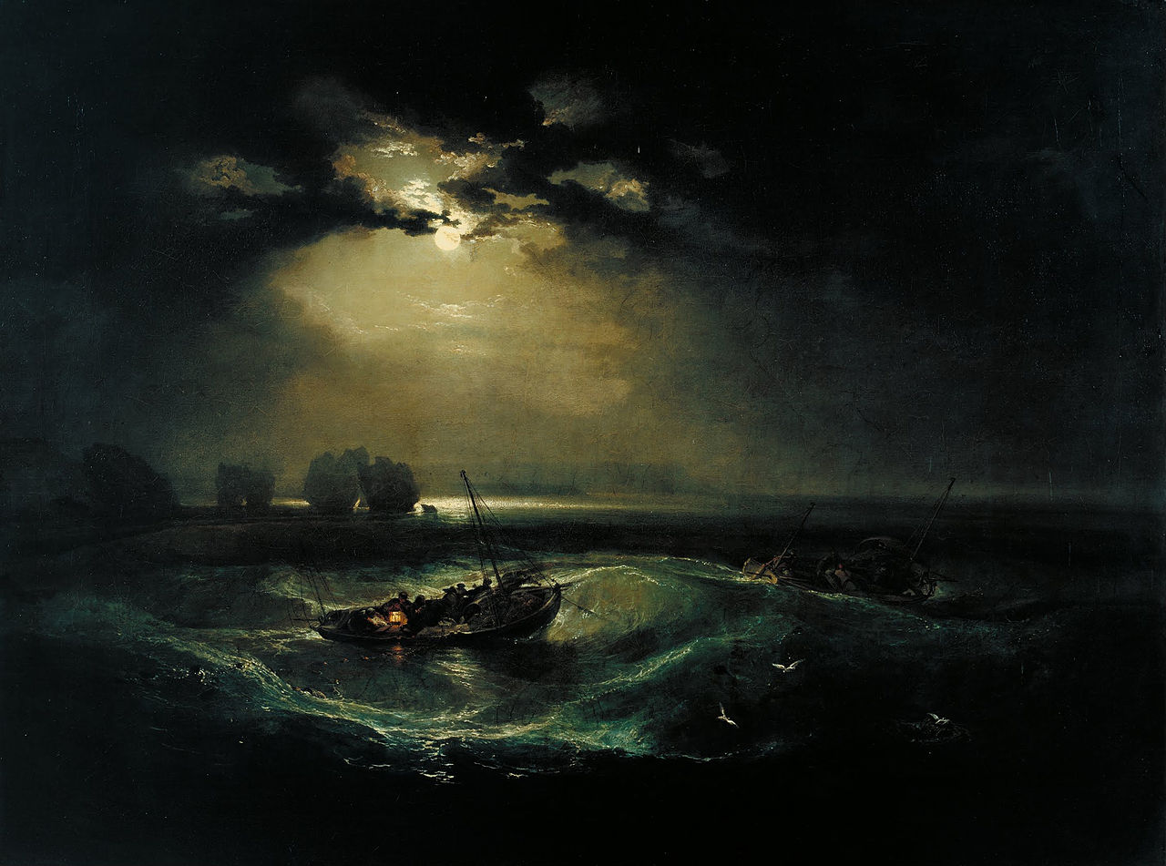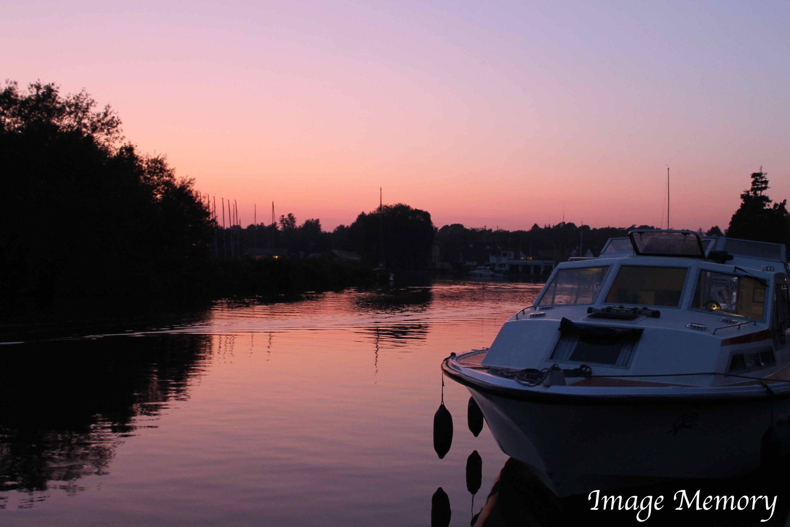
Pink Sky Reflection, The Norfolk Broads, Art Photograph, Hugo Richardson
Pink is a colour with a surprisingly deep and varied history. From ancient literature to global cultures, from religious symbolism to modern marketing, pink has carried meanings of love, innocence, power, luxury and even rebellion. This post explores the fascinating story of pink and the emotional impact it continues to have today.
Pink in Early Literature
In the 8th century BC, Homer’s Odyssey references pink as the rosy colour of dawn, “Then, when the child of morning, rosy-fingered dawn appeared…”
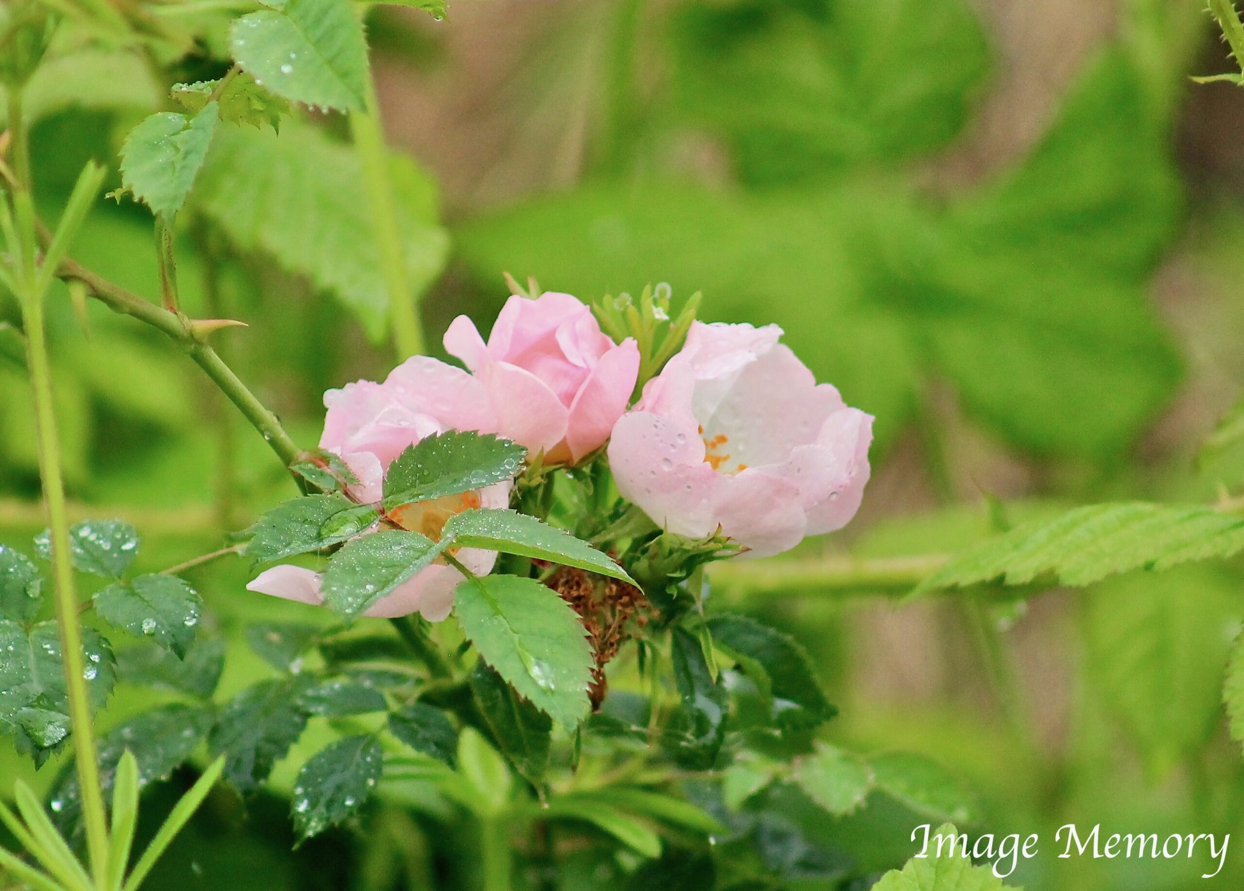
Wild Rose with Rain Drops, Art Photograph, Hugo Richardson
Suffolk Pink: A Colour With History
Suffolk Pink, seen on many historic buildings in the region, dates back to the 14th century. The colour was traditionally created by adding elderberries to limewash, though sloe berries, blackthorn and even ox blood were also used. These additions were believed to strengthen the protective qualities of the limewash.
The ‘Suffolk Pink’ colour is highly protected and regulated by local councils and English Heritage. Marco Pierre White once painted The Angel in Lavenham a shade of ‘blancmange’ in 2013 that offended the locals and the council. He was forced to repaint, only after the right shade of pink was agreed with English Heritage.
Pink in Religion and Symbolism
Biblically, pink is associated with being in right relationship with God. It symbolises the “Love of God,” combining the red of Christ’s blood with the purity of white. In some artworks, Jesus is shown wearing pink to evoke innocence and the womb.
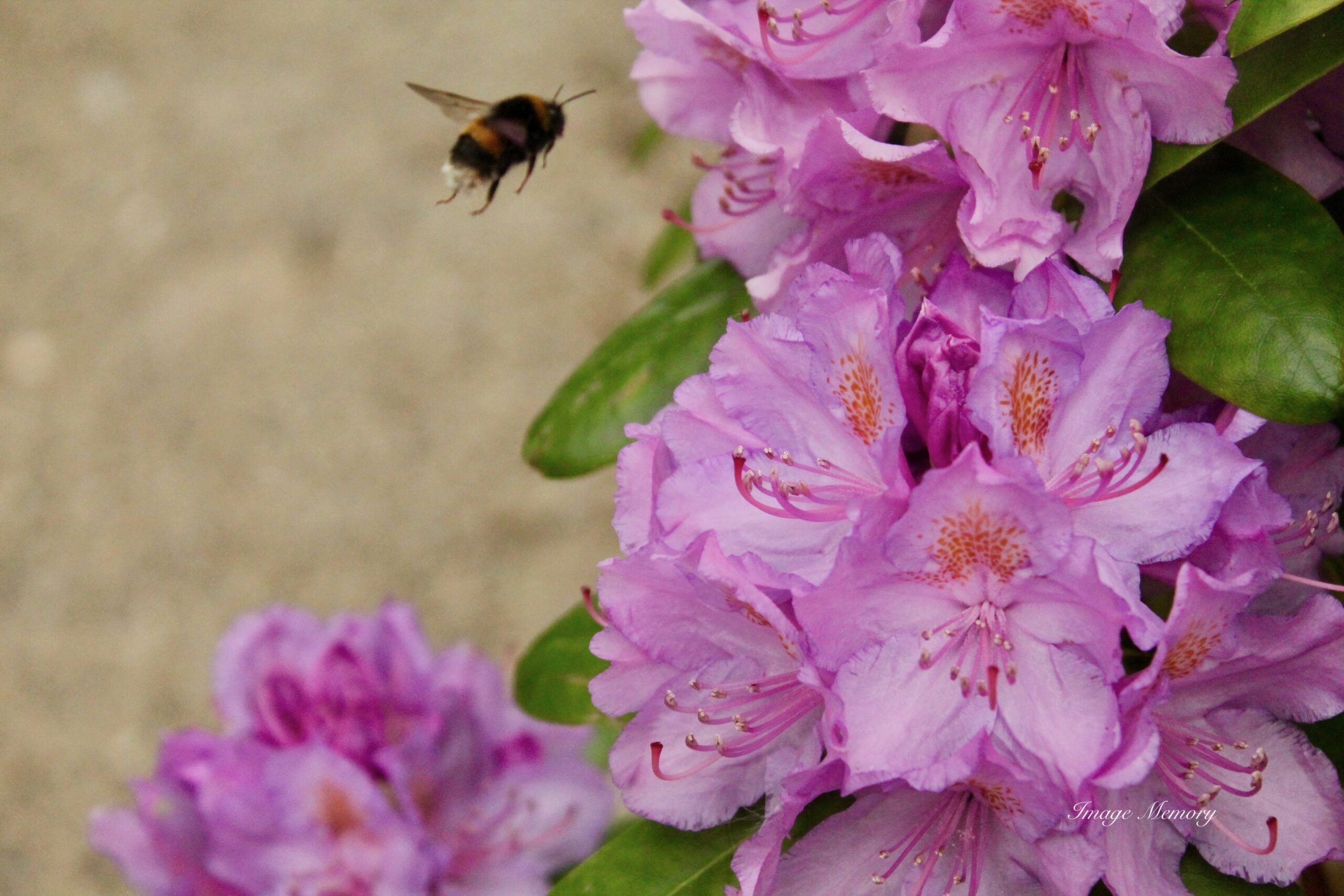
Pink symbolises friendship, beauty, faithfulness, compassion, romance, love and sensitivity. Pink roses, for example, represent admiration, happiness and familial love.
How Pink Pigments Were Made
Light red eventually evolved into the colour term “pink.” Historically, pink pigments were produced by mixing alum and chrome mordant with brazilwood dye or with madder roots plant Rubia tinctorum.
Mixed with white, pink can also be made using red from the cochineal insect. Cochineal was cultivated commercially in Poland, Prussia, Saxony, Lithuania and the Ukraine in the 18th century.
The cochineal harvest started on the fifth hour (between eleven o’clock and noon) of St John the Baptist’s feast day on the 24th June, accompanied by religious ceremonies. Some stories are hidden deep in language, in words we use daily, but the origins of which have been long forgotten.
Polish cochineal is also known as Polish lac and the cochineal insect is known in Polish as Czerw. The female of the cochineal, in the late larva state, was collected and boiled in water with vinegar. They were then dried in the sun, or in ovens and ground with bread acid to produce a dye.
But as many as 155 thousand insects were required for 1kg of dye, pushing red textile prices through the roof. Polish noblemen, monarchs and high clergy were the only people that could afford cloth dyed with cochineal, also known as Saint John’s blood.
The first flags and banners of the Kingdom of Poland show a white-crowned eagle on a red background, and the white and red flag represents Poland to this day.
From the 16th Century, Polish cochineal was predominantly replaced by cochineals from the New World.
Pink symbolises friendship, beauty, faithfulness, compassion, romance, love and sensitivity.
Pink roses, for example, symbolise love between family members, admiration and happiness.
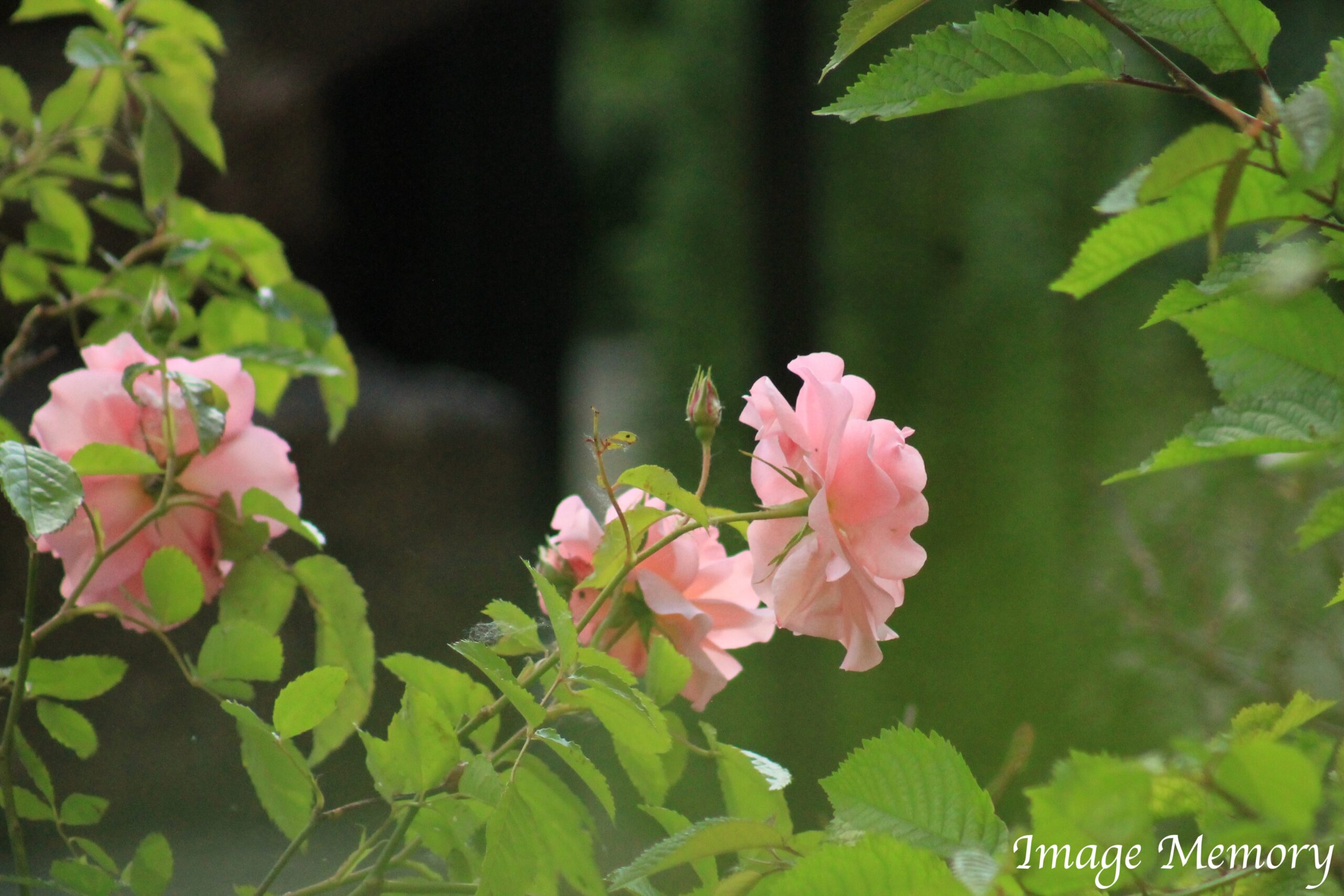
Pink Roses, Art Photograph, Hugo Richardson
Pink in Global Cultures
Pink carries different meanings around the world:
In Japan, the colour pink has a masculine association. The Sakura pink cherry trees that blossom in spring represent young warriors (Samurai) who fell in battle in the prime of their life.
Pink is a sign of trust in Korea.
In Latin America, it’s symbolic to architecture.
In India, Jaipur City is a tourist attraction. It has forts, palaces, temples and bazaars which are predominantly pink. The geography is often called ‘The Pink City’.
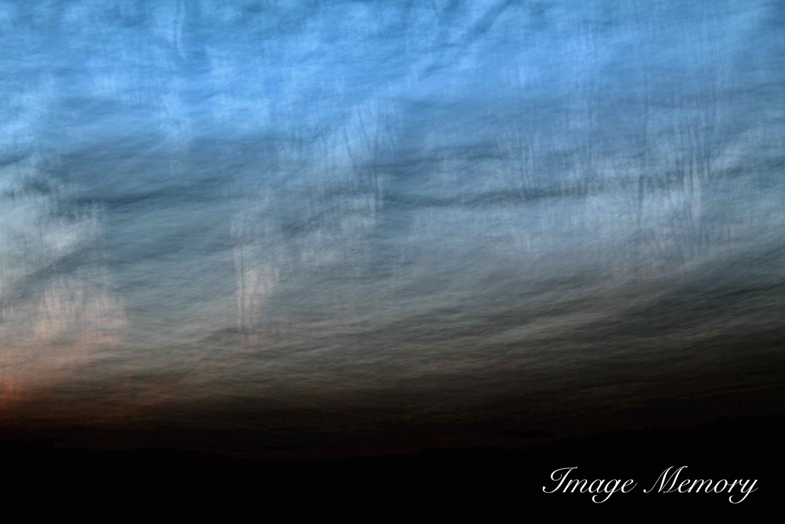
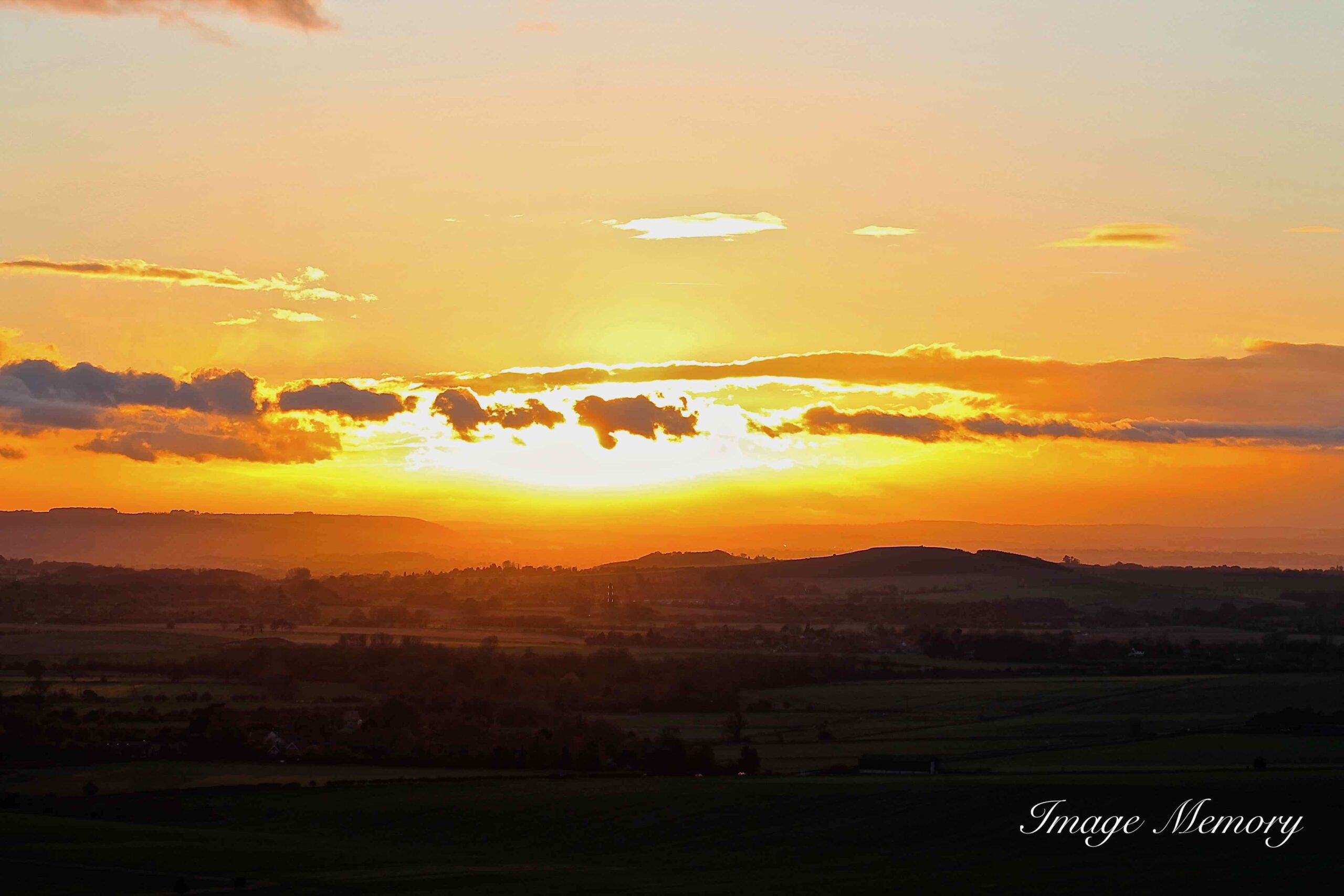
Pink in the Sky and Natural Light
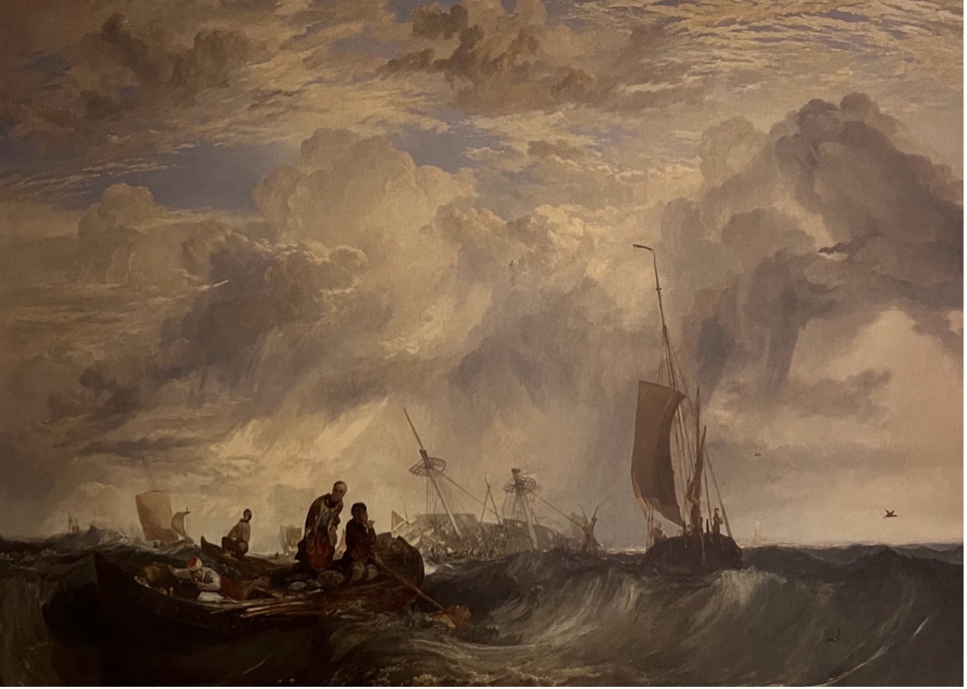
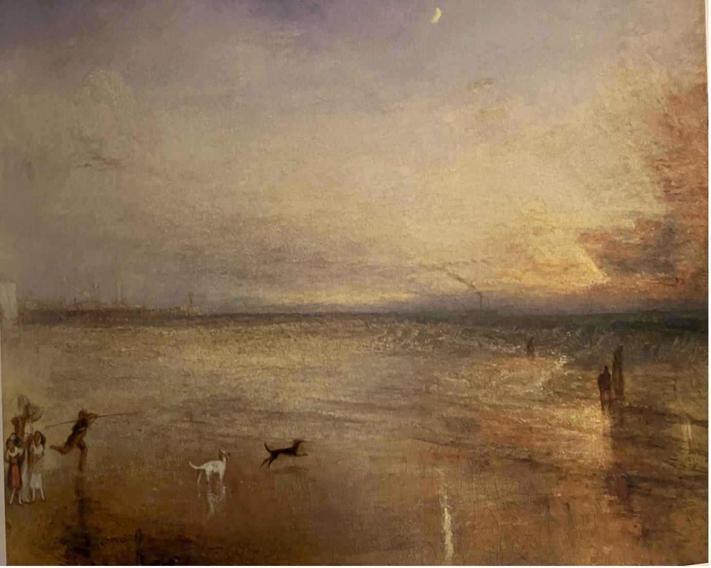
Clouds often appear pink at certain times of day. This happens because sunlight scattered by clouds is also scattered by air molecules. Shorter?wavelength colours such as green and blue are scattered out of our direct line of sight more than red. The atmosphere preferentially scatters blue light toward us — a phenomenon known as airlight.
Airlight is responsible for the blue sky and contributes to the blue appearance of distant mountains, such as the Blue Mountains in Australia. Because airlight is polarised, its intensity changes depending on the setting of a camera’s polarising filter. When reddened sunlight and scattered blue light combine, the result is the soft pink glow we often see in clouds.
It is responsible for the blue sky and partly for the blue colour of distant mountains Airlight is polarised and so the intensity depends on the setting of the camera polarising filter. The reddened light and blue light together produce the pink.
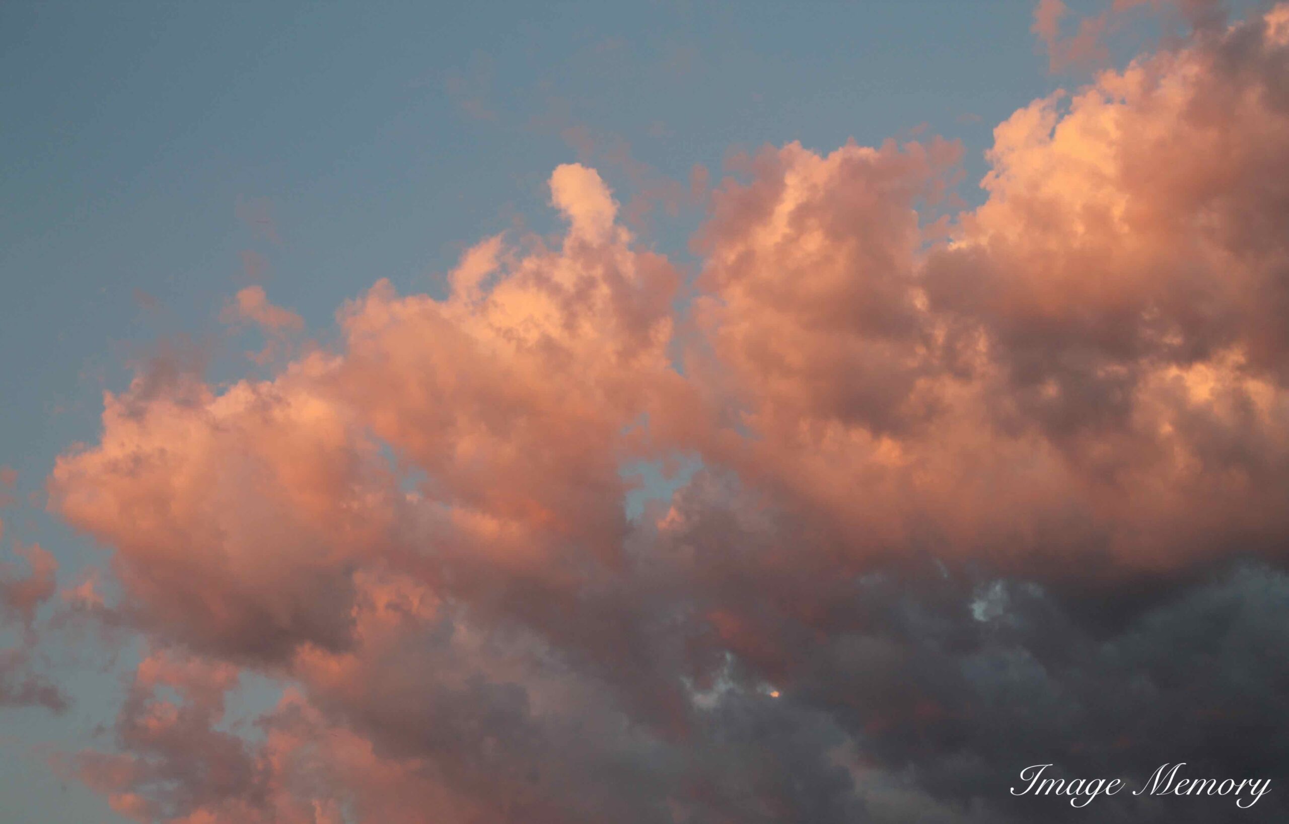
Pink Clouds, Art Photograph, Hugo Richardson
Pink in Maps and Empire
Traditionally, territories of the British Empire were coloured pink on maps. This was a practical compromise: red was the colour associated with the Empire, but printing colonies in red made place names difficult to read on globes and atlases. Pink provided a clearer, more legible alternative.
Pink as a Symbol of Luxury
In the West, Pink first became fashionable when European aristocrats, both men and women, wore a faint pink powdery variance as a symbol of luxury and class.
Pink in the Natural World
In the natural world, one of the most dramatic colours of pink can be found on the flamingo. Their colour is as a result of the food that they eat which is mainly algae and brine shrimp. The body of the flamingo metabolises the pigments which turn its feathers pink.
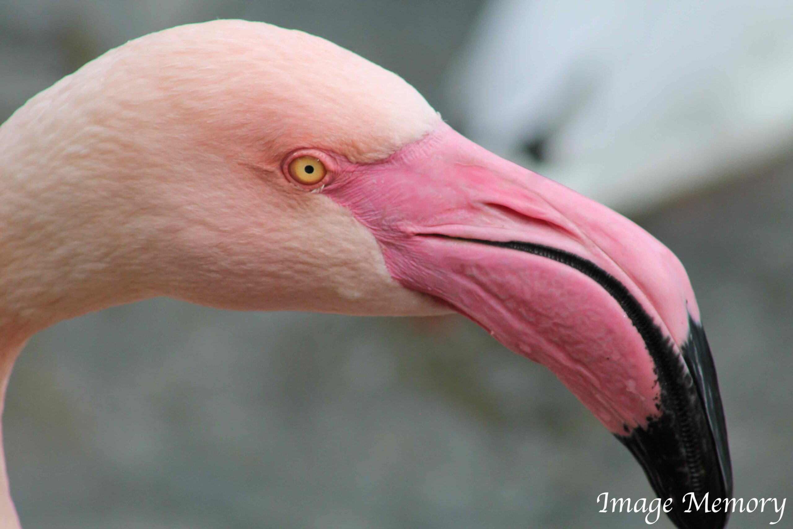
Flamingo, Art Image, Hugo Richardson
Pink in Psychology and Behaviour
In 1979 in the US, penitentiaries were painted pink as an experiment to reduce violence. This type of pink is called ‘Baker-Miller’. The reason being that the experiment on the first correctional institution was directed by Baker and Miller.
The early research was found to be flawed. While pink’s calming effect has been demonstrated, researchers of colour psychology have found the effect only occurs during the initial exposure to the colour. When used in prison, the inmates often become even more agitated once they become accustomed to the colour.
Pink, Gender and Marketing
In the Western world today, pink is widely seen as feminine — . Barbie pink for girls, blue for boys. But historically, this was not the case. Until the early 20th century, pink was considered a masculine colour, while blue was associated with femininity and the Virgin Mary.
This shifted in the 1940s when retailers realised they could increase sales by marketing colours to specific genders. By the 1950s, everything from toys to toothbrushes was colour?coded, cementing pink as “for girls” in popular culture.
The Rise of Rosé Wine
A very interesting marketing phenomenon has been the massive increase in the consumption of rose wine. There are a number of reasons for this, some of which include the colour.
The ‘salmon’ shade of Rosé wine is generally the leader globally. However, an apricot shade of rose wine is preferred by consumers in the Bordeaux region.
Global consumption of rose wine has increased by 30% in 15 years. In 2013 alone, the United States consumed 279.4 million litres (nearly 74 million gallons) of pink wine.
The increase of rose consumption appears to be based upon the attractively of its colour. Rosé is very popular with the millennial generation. The pink is perfect for Instagram posts and influencers like Angelina Jolie and Brad Pitt, who own the award-winning producing Chateau Miraval has also helped.
Here are all the reasons, following some research on the web:
- Rosé production quality has increased
- Rosé has a lower propensity for producing a hangover compared to other wines
- More and more women are looking for lightness and freshness
- Rosé is being promoted by celebrities
- It looks good on social media
- There is a wide range of sweet to dry options
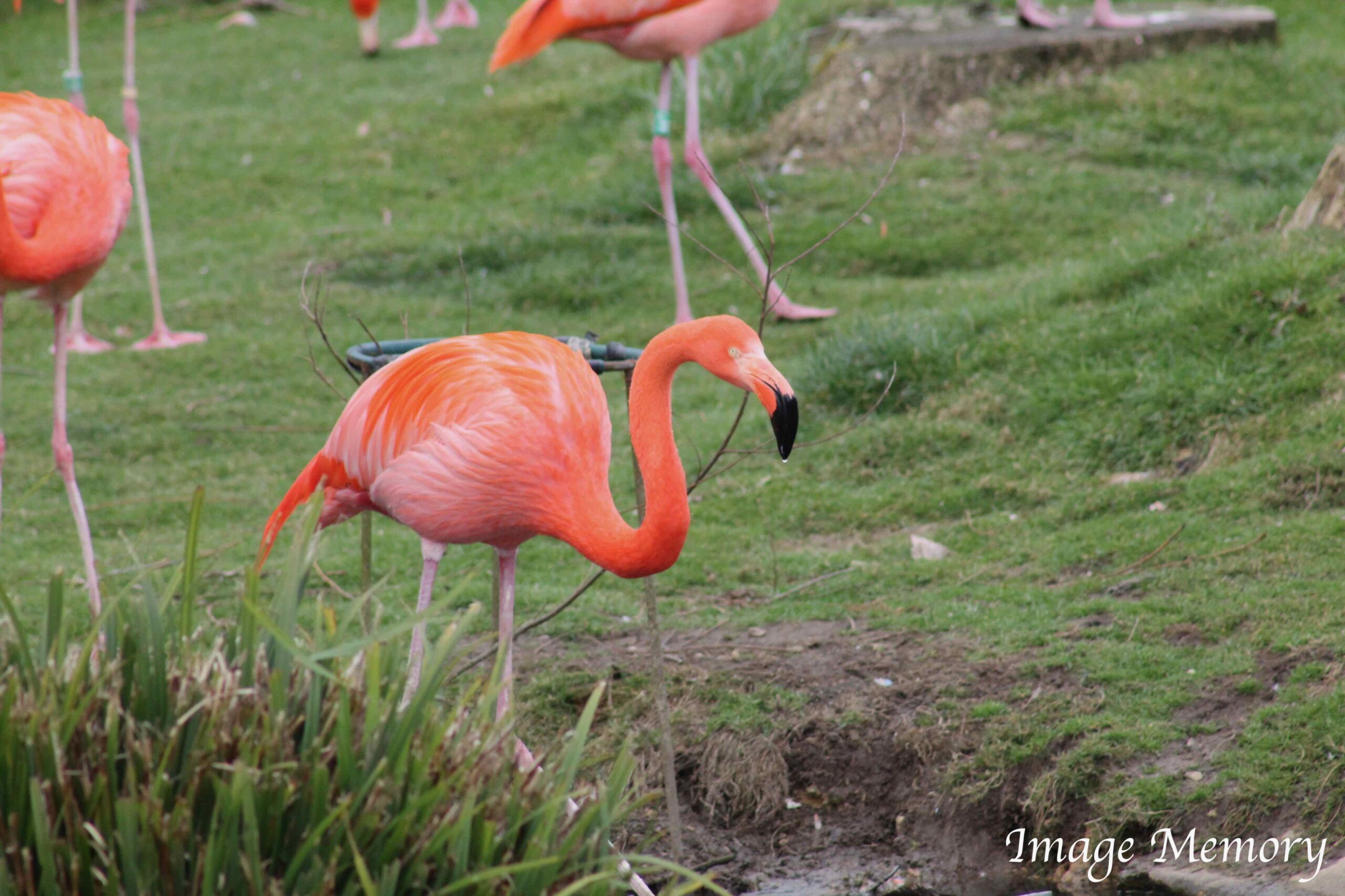
Flamingos, Art Image, Hugo Richardson
Please feel free to communicate with me about the ‘blogs’ we publish.
Email: hugo.richardson@image-memory.com
Tel.: 07476 343 777